PDF Design Prep Templates
FREE Downloads that will help you design
your print product.
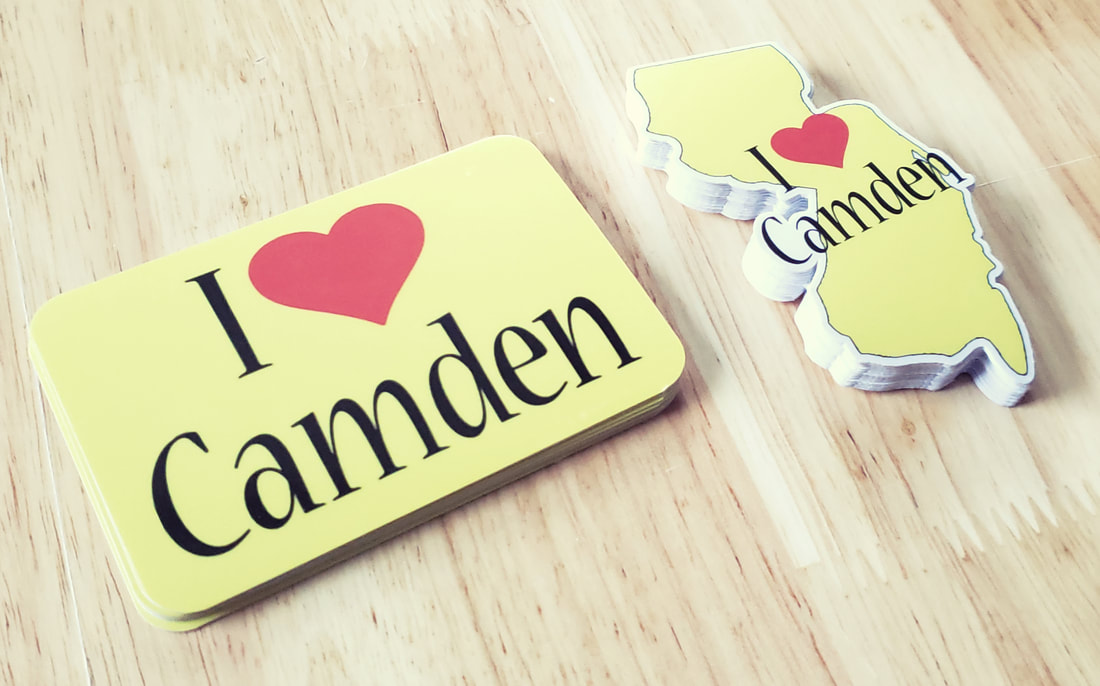
Business Cards
| businesscards.zip |
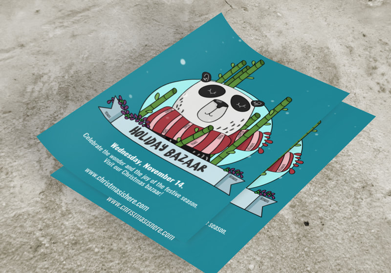
flyers
| flyers.zip |
postcards
| postcards.zip |
invitations/announcements
| invitations_announcements.zip |
canvas
| printedcanvas.zip |
table covers
| tablecovers.zip |
3-part ncr forms
| ncrforms.zip |
Pull up banners
| pullupbanners.zip |
posters
| posters.zip |
presentation folders
| presentationfolders.zip |
Calendars
| calendartemplates_2024.zip |
banners
| vinyl_banners.zip |
Tear cards
| tear_cards.zip |
Gift vouchers
| gift_vouchers.zip |
a-frame signs
| a-frame_signs.zip |
Vehicle magnets
| vehicle_magnets-round.zip |
numbered tickets
| numbered_tickets.zip |
square / rectangle magents
| sq_rec_magnets.zip |
floor decals
| round_square_flr_decals.zip |
PINBACK BUTTONS
| pmd_pinback_buttonsartboard_2.pdf |
YARD SIGNS
| coroplast_signs.zip |
BROCHURES
| brochures.zip |
Steps to Print Success
Step 1
Ensure the artwork matches the product’s required production dimensions (the artwork must be the size needed for production). The artwork must be created in CMYK 300 dpi or higher with 1/16 inch bleeds on all sides.
Step 2
Make sure that all images are embedded, and that all the text is outlined. This eliminates font searching and dropped fonts along with broken image links.
Step 3
Export all files into PDF format with bleeds. Export artwork from your design software. This ensures proper PostScript output needed to produce your products.
Step 4
Browse to your saved PDF files and upload them to our server. Your uploaded files will be added to your order. Once your order is processed you will receive a digital proof via email prior to production needing your approval.
These files are to assist you in setting up your print ready PDF files for us to be able to print your products. You may also use it as a guide if you have print ready files ready. Please check our template against your print ready PDF to make sure you within all margins before uploading to product page.
File Preparation Guidelines:
- Download our prep guides to ensure a more optimal print result.
- Be sure to DELETE any hidden layers that are not intended to print (ie: setup guide layers or other hidden artwork layers) to ensure no risk of them appearing on the final print.
- Each job (including multiple paged projects) must be submitted as a single PDF file. Ensure that all pages are the same size.
- Files must be submitted with proper orientation to ensure proper back up.
- It is best to try to avoid using borders in your design. If a border is too close to the trim, the trim may be slightly off-center.
- File must consist of 1/8" bleed and all important art and text must be within the safety margin.
- Ensure that your PDF is high res and that all images are CMYK at 300 DPI.
- Black type should have the following values: C0, M0, Y0, K100.
- Embed or outline all fonts.
- For best color results, supply a CMYK only files.
Understanding Bleeds, Margins, Cut Lines, & Safety Zones
Bleed Margin: This is your ‘bleed’ line. Your background/color shall extended to this line.
Cut Line: This is your ‘cut line’. This line represents where your print product will be cut to its finished product.
Safety Zone: This is your ‘safety line’ or some shall say safety zone. You will place all important information that is not getting cut inside this line. We recommend not designing all the way to this line. Give your information a little cushion for best results.
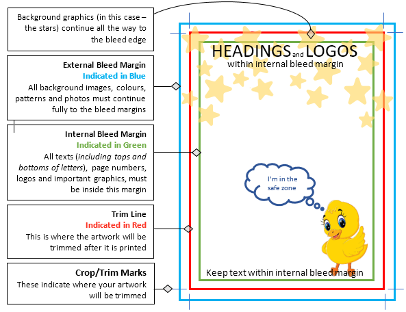
Example of bleeds, safety zones, and trim lines (cut lines)
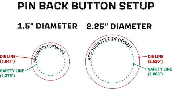
Example of die-lines on pinback buttons that are the cut lines
What is a dieline?
A dieline is a visual representation of how the print object is to be cut out as part of the finishing process. A dieline is usually recommended for projects with a custom shape. It indicates exactly how to cut the file.
A dieline is a visual representation of how the print object is to be cut out as part of the finishing process. A dieline is usually recommended for projects with a custom shape. It indicates exactly how to cut the file.
NO DIE-LINE
|
WITH DIE-LINE
|
Here's how to create die-lines
Creating a die-line is simple. A die-line should be a stroke in a spot color that is named exactly ''CUT''. This should be on a separate layer from the artwork, but in the same file.
PMD LLC® strongly recommends using Adobe Illustrator to create files that contain die-lines. Here is a quick tutorial on how to create die-lines with Illustrator.
**If you do not have an attribute window on the left panel, go to "window" on the top menu and then select "attributes". The attributes window should now pop up.
Checklist for your die-line.
Creating a die-line is simple. A die-line should be a stroke in a spot color that is named exactly ''CUT''. This should be on a separate layer from the artwork, but in the same file.
PMD LLC® strongly recommends using Adobe Illustrator to create files that contain die-lines. Here is a quick tutorial on how to create die-lines with Illustrator.
- In Illustrator create a new layer and call it ''CUT''.
- Select the Die-line layer and create a stroke using the shape tool or the pen tool to outline the shape of the design.
- Once the outline is complete, select the shape, and in the color swatches panel create a new color.
- Make sure that the color name is set to ''CUT'' (with that exact spelling and capitalization) and the color type is set to spot color.
- Make sure that the color you just created is added to the object as a stroke color with no fill color.
- Select the object again and go to the attributes panel to make sure that overprint stroke is check marked.
- Once the stroke is defined as a spot color named ''CUT'' and is set to overprint, save or export the file as a high-resolution PDF or Al file.
**If you do not have an attribute window on the left panel, go to "window" on the top menu and then select "attributes". The attributes window should now pop up.
Checklist for your die-line.
- The die-line is on its own layer
- The die-line is a spot color called exactly ''CUT''
- The overprint of the die-line is on
- The die-line is a stroked vector object (no fill) that can be deleted
Understanding GSM
If you have ever ordered business cards, invitations, or some other printed paper product, you may have heard of the term “GSM.” Or, perhaps you ordered a printed product in bulk and had to iron out the nitty-gritty details of your purchase, including paper size and thickness.
You may have encountered this term during that process. If you haven’t heard of it, it’s time you did, especially if you’re constantly ordering printed products. This term can help you more precisely specify exactly what you want, whether you’re ordering business cards, flyers, posters, signs, stickers – or any other type of printed matter.
What Is GSM Paper? The term “GSM” stands for “grams per square meter.”
For this standard, the weight of various types of paper is measured from a sample sheet cut to one square meter in size. No matter the length or width the paper becomes, the weight measurement is always taken from the square meter sheet.
For example, paper with a weight of 55 gsm will be much, much lighter and thinner than paper weighing 400 gsm. The 400 gsm paper, meanwhile, will be heavy, thick, and much more durable.
In addition, 55 gsm paper will not weigh that amount when it’s cut to letter-size or poster-size. However, both still are considered 55 gsm paper, because that number represents a certain thickness or thinness. For instance, the letter-size paper is A4, 55 gsm paper. The first measurement refers to the length and width, while the second measurement refers to the weight and thickness.
Why Does the Weight of Paper Matter?
As you can probably guess, paper with a lighter weight is best suited for specific applications, while thicker, heavier paper is better for others. Knowing the ideal GSM for your paper product can help you make a good decision regarding design and the way it will be used.
Here’s an example: Business cards are small but contain important information. They’re often saved or even passed around between contacts, business partners, and potential customers. As such, they need to be thicker, stiffer, and more durable than your average piece of paper.
On the other hand, flyers announcing a sale or an event have a temporary use. They communicate information to whoever receives them, and then they’re usually thrown away. As such, these are often printed on flimsier paper with a lighter GSM.
If you’re constantly ordering printed paper products, knowing the standard GSM for what you need is incredibly useful.
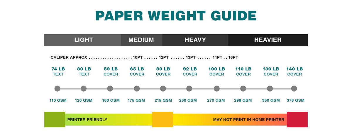
Example of paper weights
What Are GSM Paper Types and How Are They Used?
There are lots of various standards for GSM paper. The weight determines what the paper is used for, and is often called the paper’s “grammage.” Here’s a quick summary of the standard weights:
35-55 gsm – The lightest type of paper, ranging from translucent tracing paper to newsprint.
75-90 gsm – You’ll find this weight of paper in sketchpads or notebooks. It’s thick enough to draw on with pencil, but heavy ink or marker may bleed through.
90-100 gsm – This is the weight of most types of household printer paper.
120-140 gsm – The weight of your average promotional poster. Think movie posters hanging on a teenager’s bedroom walls or product posters hanging in store windows.
210-300 gsm – This thicker type of paper is stiffer but still bendable. You’ll see it used for some magazine
covers and higher-quality flyers. This is also the weight of most paper used for watercolors or painting.
350-450 gsm – The highest GSM paper is pretty much cardstock. This is the stiffest, sturdiest paper and is used for business cards and invitations.
An Easy Way to Know Your Paper Thicknesses
Once you understand what GSM paper is, not to mention the other standards for measuring the weight and thickness of paper, it becomes a lot easier to choose the weight that’s right for your project.
PMD can help you determine the right weight and size of paper that will perfectly suit your needs. Whether you need business cards, greeting cards, or any other type of printed product, let us show you what high-quality, professional printing looks like.
What's the Point (PT)?
GSM stands for grams per square metet and PT stands for point. Both units are used in measuring the thickness of packaging material, typically paper and cardboard. To answer this question, we’ve provided some more insight on these measurements.
If you’re thinking about GSM vs. PT, both terms are used to measure the packaging thickness and to determine how much material stock is needed to create packaging tailored to your products’ needs.
What is the Point (PT) System?
PT, or point, is a way to calculate the thickness of a paper stock by using the caliper of the paper. Printers and paper manufacturers will measure the caliper of the paper using a micrometer. Paper caliper is determined in thousandths of an inch.
Here is a quick guide to assist in converting the paper types between various types of systems.
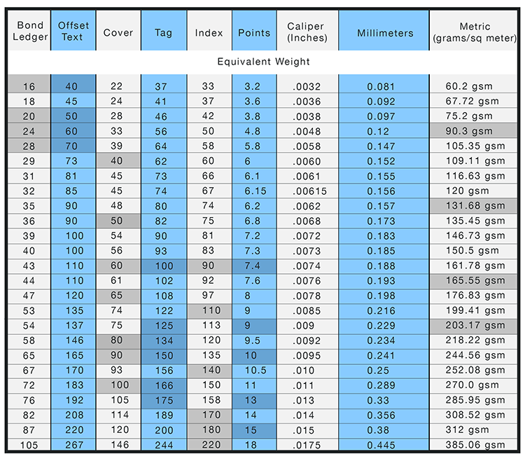
Example of GSM conversion chart
Sublimation Printing Guidelines
Why Choose Dye-Sublimation?
Vibrant Colors
Unmatched colors and intense blacks with sharp contours and smooth gradations
Washable Fabrics
Dye-sub inks become part of the fabric and won’t wash out
Durable Images
Images don’t scratch, chip or flake and won’t crack when stretched
Versatile Applications
Transfer images to a wide variety of substrates and fabrics. Dye sublimation gives a photo realistic
impression in a hi-resolution display. We use a four color process (CMYK) .
Create and upload elements of your artwork
For best results, we recommend building your artwork in our mockup generator platform. This means you create elements of your artwork in your usual design software and save each element (e.g. logo, slogan) as a separate file. You do not need to create a complete printable file with all the elements together. You can upload your elements as individual files in our mockup generator and position them there to create the printable layout you require.
Submit files in PNG or JPEG format with at least 300 DPI
We recommend using PNG for designs with a transparent background. For other designs, we advise preparing files in JPEG instead.
Create files in sRGB color profile
To ensure that your design looks as close as possible to what appears on your screen, make sure you create your print file in sRGB color profile.
Remove print file template guidelines
If you use our downloadable templates, delete the guide layers before saving your files. If you don’t delete them, they’ll show up on the print.
Tips for Best Results
• Avoid semi-transparent designs
Semi-transparent graphics (or elements with lowered opacity) don’t translate well in Sublimation printing. We advise using solid colors or simulating semi-transparency by halftoning (for more information, see our video tutorial).
• Create designs with the necessary DPI
Simply typing in a new resolution value into the file won’t result in a higher resolution print. If your graphic’s resolution is too low, the best solution is to recreate it.
• We recommend using darker colors, as lighter colors may be less visible when printed.
• Avoid very thin details
For best results, avoid using thin fonts and elements thinner or smaller than 2px wide (0.02″). We recommend making text at least 5px in size.
DTG Printing Guidelines
What is Direct to Garment (DTG) printing?
DTG is less complicated that you would expect given that it can capture complicated images so accurately on something as soft as a shirt or sweater. The best way to think of DTG is like at home printing from your computer, except that the paper is replaced with a shirt. Like your at home printer, DTG printers do not need to be set up for individual jobs and can render millions of colors.
Some DTG printers are even manufactured by companies that make standard inkjet printers like Brother, but are simply modified to accommodate the additional bulk of garments and use inkjet textile inks, instead of what you buy for your printer at the store. The cost of ink is a little bit more, which is why printing on colored garments (black and vivid colors) is somewhat costly; an under base of white ink has to be laid below the actual colors of your design to ensure that the colors look like you intended. The white under base provides a solid white base for your other colors to lay on top therefore giving you vibrant and bright colors throughout.
The process used for translating the colors from the digital image into ink to print onto the garment relies on the CMYK color model plus your white underbase (CMYK+W). CMYK+W stands for cyan, magenta, yellow, K for black, and W for white. This model is also referred to as four color processing because it uses combinations of these four ink colors, CMYK, usually applied in the order in which they appear in the acronym, to create all the colors in the digital design. The inks bind directly to the fibers of the garment's material, which is why cotton a fibrous material is better for DTG printing than polyester - a much smoother material. Once all the colors have been added and the design is complete, heat will often be used to cure the ink. This entire process can take hours for a screen printer to achieve and minutes for a DTG printer.
Why DTG printing over Screen Printing?
Digital printing is a much newer process that involves your artwork being processed (Raster Imaging Process (RIP) by a computer and software, and then printed directly onto the surface of your product. The fact that the digital printer does not use screens allows for a photographic print, with much more detail than traditional screen printing at much lower production costs.
Create and upload elements of your artwork
For best results, we recommend building your artwork in our mockup generator platform. This means you create elements of your artwork in your usual design software and save each element (e.g. logo, slogan) as a separate file. You do not need to create a complete printable file with all the elements together. You can upload your elements as individual files in our mockup generator and position them there to create the printable layout you require.
Submit files in PNG or JPEG format with at least 150 DPI
We recommend using PNG for designs with a transparent background. For other designs, we advise preparing files in JPEG instead.
Create files in sRGB color profile
To ensure that your design looks as close as possible to what appears on your screen, make sure you create your print file in sRGB color profile.
Remove print file template guidelines
If you use our downloadable templates, delete the guide layers before saving your files. If you don't delete them, they'll show up on the print.
Tips for Best Results
• Avoid semi-transparent designs
Semi-transparent graphics (or elements with lowered opacity) don't translate well in DTG printing. We advise using solid colors or simulating semi-transparency by halftoning (for more information, see our video tutorial).
• Create designs with the necessary DPI
Simply typing in a new resolution value into the file won't result in a higher resolution print. If your graphic's resolution is too low, the best solution is to recreate it.
• Use transparency to your advantage
Black ink will appear gray on black garments because of the white underbase used during printing. Leave these areas fully transparent when designing for black garments.
Disclaimers
- If images are upload with a non-transparent background, this background will appear when printed.
- We don't print white ink on white shirts. Any designs for white shirts containing white color will have areas with no print on them.
- White ink elements on bright-colored garments might look tinted. This is most evident on red, maroon, and other similarly colored garments.
- Follow instructions on laundry tag and our provided washed care instructions for longevity and durability of your imprint. Plenty Moore Designs LLC® is not responsible for damage caused otherwise.
- There might be slight discrepancies in print placement.
- For smaller apparel sizes, we may scale down artwork proportionately to fit it within the printable area. Sizes XS, S have a maximum print area of 9X12 (inches)